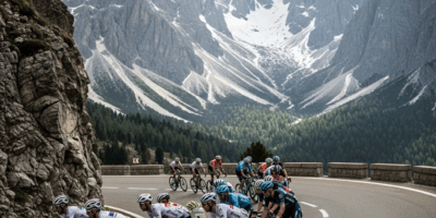
Every January, WorldTour teams unveil their new kits and cycling fans immediately begin arguing about which ones look brilliant and which ones look like a graphic designer lost a fight with a sponsorship deck. The 2026 season brought some genuinely sharp designs, a few that will age well, and a handful that make you wonder whether anyone at the team actually looked at the final product on a rider before approving it.
Here is how every major 2026 WorldTour kit stacks up, from the ones worth hanging on your wall to the ones you pretend not to notice in the peloton.
Top 5 — Kits Worth Buying
1. Pinarello-Q36.5 — Navy and Gold. This is the kit of the year and it is not close. Deep navy base with restrained gold accents that catch the light without screaming for attention. The shorts match perfectly — no awkward color transitions at the waist. Q36.5 has always made clean-looking kit, and giving them the canvas of a WorldTour team produced exactly what you would expect: understated, elegant, and immediately recognizable in the peloton. This is the jersey you frame.
2. EF Education-EasyPost — Pink and Silver. EF has built a reputation as the team that takes creative risks with kit design, and the 2026 edition is their best yet. The signature pink is there, but the silver metallic accents give it a space-age quality that somehow works on lycra. Rapha’s involvement in the design ensures the cut and fabric quality match the visual ambition. Bold without being obnoxious.
3. Lidl-Trek — Classic Navy, Blue, and Yellow. Cycling Weekly called it “the latest version of an icon,” and they are right. The Lidl-Trek kit has found a formula that works and refined it rather than reinventing it. Geometric details added for 2026 give it freshness without abandoning the identity that fans recognize instantly on mountain stages. The yellow accent on the collar and zipper is a small touch that ties the whole thing together.
4. Jayco-AlUla — Purple and White Flames. MAAP designed this kit and the influence shows. Purple is an unusual choice in a peloton dominated by blues, blacks, and whites, and the white flame motifs running up the flanks are bold enough to polarize opinion. That is exactly what a good cycling kit should do. You either love it or you think it looks like a bowling alley carpet. We love it.
5. UAE Team Emirates — Red, White, and Black. The home of Pogacar runs a kit that matches his racing style — clean, direct, and impossible to miss. The 2026 iteration sharpened the red, cleaned up the sponsor placement, and produced one of the more wearable fan replicas in the peloton. Not revolutionary, but consistently one of the better-looking teams in the bunch.
Solid Middle — Respectable but Forgettable
INEOS Grenadiers — The dark blue-black base is sleek enough, but the design has barely changed in three years. You cannot fault the execution, but at some point, “clean and dark” becomes “same as last year.” INEOS has the budget to do something interesting. They consistently choose not to.
Visma-Lease a Bike — The yellow-black combination remains iconic thanks to Vingegaard wearing it at the front of Grand Tours, but the design itself is functional rather than inspired. The yellow works because of what the team does on the road, not because of what the graphic designer did in the studio.
Soudal Quick-Step — Blue and white, competent, professional. Looks like a bank advertisement, which is essentially what it is. Evenepoel deserves a kit as exciting as his racing.
Red Bull-Bora-Hansgrohe — The Red Bull branding gives this kit instant recognition, but recognition is not the same as aesthetics. The color palette feels corporate rather than athletic. Roglic in this kit still looks fast, but that is Roglic, not the kit.
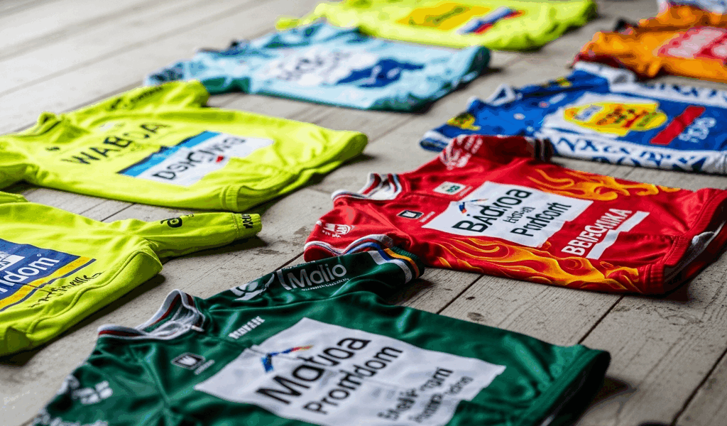
Bottom 5 — Sponsor Overload
Every year, a few teams produce kits that look like the sponsor list won the design argument. The 2026 offenders include teams where every available centimeter of fabric carries a logo, where the primary color appears to have been chosen by a committee, and where the overall effect is more NASCAR than Grand Tour.
We will spare the specific teams from a public roasting, but the pattern is consistent: too many sponsors of equal visual weight, no clear primary design element, and shorts that do not match the jersey because they were designed separately. If you squint at the peloton on a mountain stage and cannot tell which team a rider is on, their kit has failed its primary job.
The worst offenders tend to be teams with smaller budgets and more title sponsors. When three different companies all insist on equal logo placement, the design suffers. The best kits (Pinarello-Q36.5, EF, Lidl-Trek) benefit from having one or two dominant sponsors willing to let the design breathe.
Best Kit You Can Actually Buy as a Fan
Replica jerseys range from about $60 to $150 depending on the brand and whether you want the fan-cut or race-fit version. Fan-cut jerseys are slightly looser and more forgiving — designed for the Sunday morning club ride rather than the WorldTour peloton. Race-fit replicas use the same patterns as the pro version with tighter panels that sit better on the bike but less comfortably at the coffee shop.
Bobshop carries the widest selection of officially licensed WorldTour team gear in one place. All4cycling is another strong option, particularly for European teams. Individual team shops (especially EF’s Rapha collaboration) offer exclusive colorways and limited editions that the third-party retailers do not carry.
If you are buying one jersey this season, the Pinarello-Q36.5 navy-gold is the one that will look good five years from now. The EF pink is the conversation starter. And the Lidl-Trek classic is the safe choice that never goes out of style.
The Kit Design Trends of 2026
Three trends stand out across the 2026 peloton. First, darker base colors are winning. Navy, deep blue, and charcoal have replaced the bright whites and light blues that dominated a few years ago. Darker kits show less road grime and photograph better in variable light conditions, which matters when social media is a team’s primary marketing channel.
Second, metallic accents are having a moment. EF’s silver, Pinarello’s gold, and subtle reflective elements appearing on several other kits suggest that designers are exploring textures beyond flat color printing. Whether this trend survives contact with a washing machine is another question.
Third, the retro revival continues to fade. After several seasons of throwback-inspired designs, teams are moving back toward modern minimalism. The kits that look best in 2026 are the ones that look forward rather than backward — clean lines, limited colors, restrained sponsor placement, and fabric cuts that prioritize how the kit looks at 60 km/h rather than on a mannequin.


Stay in the loop
Get the latest cyclingfan.org updates delivered to your inbox.